Golden Hive - My Dream Creative Retreat
Branding
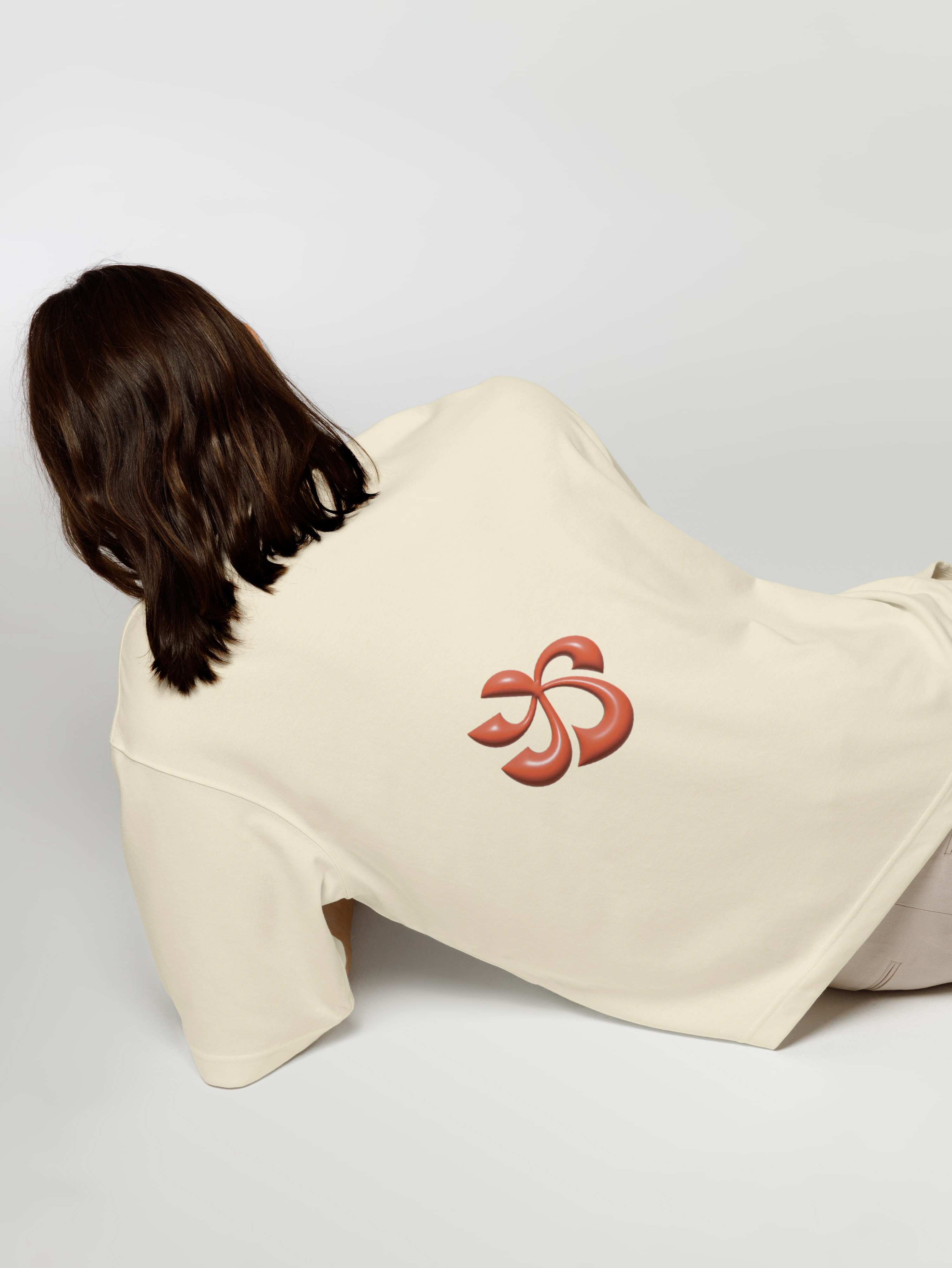
Visual Identity
Golden Hive is my dream creative retreat, designed as an escape from noise, stress, and fast-paced living. It’s a place where life slows down, where inspiration can breathe, and where colours shine in their fullest expression.
This retreat brings to life my personal vision of a calm, intentional space where creativity is nurtured and simplicity reigns.


Rooted in the essence of the golden ratio, Golden Hive is born through the hidden mathematics behind beauty in nature. This divine proportion, found in everything from flower petals, to leaves, guides the visual identity and philosophy of the retreat. It represents comfort through order, reflecting my love for structure, balance, and nature’s patterns. The name “Golden” represents this harmony, while subtly echoing my mountain roots and a longing for a stress-free, intentional life.


The “Hive” symbolizes the vibrant, buzzing community I envision at the heart of the retreat. Artists and creatives would gather here to create, connect, and grow. The hive represents productivity, community and play, a space of both structure and spontaneity. It also connects to my passion for modular patterns, geometric forms, and visual storytelling.


Golden Hive is more than a retreat. It’s a curated environment that balances freedom and order, solitude and community. From a colour palette inspired by colours found in alpine nature, to the healthy, honey based food and services provided on site, every element is designed to spark creation. Here, creatives can unplug from chaos, reconnect with nature, and reimagine what it means to live and make with purpose. It’s a retreat where ideas bloom, and where beauty lives in every detail.


